
This post is inspired by the #tidytuesday CHAT data set and focuses on the diffusion and adoption rates of media technologies since 1992. Most interesting is probably the current data about internet users, whereas the statistics on radios, television sets, and newspaper circulation are only available up to about the year 2000.
On the technical side, this post shows how to combine information from different data sources in R / RStudio and visualize the results using tidyverse and ggplot2 in particular.
Importing, merging, and reshaping data from three different sources
# install.packages("tidytuesdayR")
library(tidytuesdayR)
library(tidyverse)
library(scales)
library(janitor)
theme_set(theme_light())

# the main data set
tuesdata <- tidytuesdayR::tt_load(2022, week = 29)
tech <- tuesdata$technology
tech
rm(tuesdata)
comm <- tech %>% filter(category == "Communications") %>% select(-category,-group)
comm %>% count(variable)

# extract the variable descriptions for plot labeling later
labels <- tech %>% filter(variable %in%
                  c("internetuser", "radio", "tv", "newspaper", "label")) %>%
  select(label) %>% unique()
(labels <- labels$label)
In the communications category of the raw data, there are 12 different media technologies of which we’ll select the four mentioned above. The data has quite an odd format in that it has a generic ‘value’ column paired with the name of the media technologies in the ‘variable’ column in a long format, rather than having separate columns for each technology.
# A tibble: 70,858 x 5
   variable label                              iso3c  year    value
   <chr>    <chr>                              <chr> <dbl>    <dbl>
 1 cabletv  Households that subscribe to cable AFG    1992       0
 2 cabletv  Households that subscribe to cable AFG    1993       0
 3 cabletv  Households that subscribe to cable AFG    1994       0
 4 cabletv  Households that subscribe to cable AGO    1999    6319.
 5 cabletv  Households that subscribe to cable AGO    2000   11396.
 6 cabletv  Households that subscribe to cable ALB    1996       0
 7 cabletv  Households that subscribe to cable ALB    2002    7160.
 8 cabletv  Households that subscribe to cable ARG    1993 3605527
 9 cabletv  Households that subscribe to cable ARG    1994 4159364
10 cabletv  Households that subscribe to cable ARG    1995 4713815
# ... with 70,848 more rows

# A tibble: 12 x 2
   variable                  n
   <chr>                 <int>
 1 cabletv                1451
 2 cell_subsc             7855
 3 computer               2144
 4 internetuser           4883
 5 mail                   6270
 6 newspaper              5964
 7 radio                 10344
 8 servers                2333
 9 telegram               6183
10 telephone              7297
11 telephone_canning_wdi 11143
12 tv                     4991
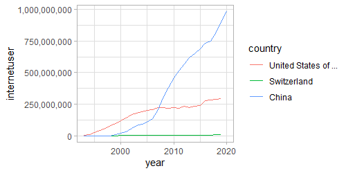
This data on media technology adoption basically only has absolute numbers for a lot of years and a lot of countries, but it is difficult to compare across countries since we don’t have the population sizes yet. For example, comparing the number of internet users across Switzerland, the United States, and China, we can’t see that the adoption is in fact highest in Switzerland:
The population data is available to download from the World Bank and can be saved locally as a CSV file and then imported into R. I also found a table that lists the region and subregion of each country online which might be useful for grouping and can be directly imported into R from the web. I am using dplyr’s inner_join() function here to merge the new data with the tech adoption data and matching the three-letter country codes and then pivot_wider() to get the data into a more useful shape.
## Data on regions from web ----
countries <- read.csv("https://raw.githubusercontent.com/lukes/ISO-3166-Countries-with-Regional-Codes/master/all/all.csv",
                      encoding = "UTF-8")
countries <- countries %>% select(name, alpha.3, region, sub.region)

comm <- comm %>%
  inner_join(countries, by = c("iso3c" = "alpha.3")) %>%
  janitor::clean_names()

## World Bank population data (local CSV downloaded from https://data.worldbank.org/indicator/SP.POP.TOTL) ----

wb_pop <- read_csv("WB_pop.csv", skip = 4) # from readr/tidyverse, not base read.csv
#wb_pop <- wb_pop %>% janitor::clean_names()
wb_pop <- wb_pop %>%
  select(-`Country Name`, -`Indicator Name`, -`Indicator Code`,
         -`2021`, -X67)

wb_pop_long <- wb_pop %>% pivot_longer(`1960`:`2020`,
                        names_to = "year",
                        values_to = "population") %>%
  rename(country_code = `Country Code`) %>%
  mutate(year = as.numeric(year))

comm <- comm %>% inner_join(wb_pop_long, by = c("iso3c" = "country_code",
                                        "year" = "year"))
# For pivot_wider, need to exclude the label variable,
# otherwise we get a separate row for each unique label
comm <- comm %>% select(-label) %>%
  pivot_wider(names_from = variable, values_from = value)
A last data cleaning step takes care of some remaining issues such as factor orders and naming in order to produce nicer plots:
comm_plots <- comm %>%
  mutate(country_code = as_factor(iso3c),
         iso3c = NULL,
         country = name,
         name = NULL,
         country = str_trunc(country, 20, "right"),
         country = as_factor(country),
         region = as_factor(region),
         sub_region = as_factor(sub_region)) %>%
  group_by(region) %>% # for the order of facet_wrap
  mutate(N = n()) %>%
  ungroup() %>%
  mutate(country = fct_reorder(country, N)) %>%
  filter(year > 1992) %>%
  filter(country_code != "PRK")# North Korea has bad data
With this data in this form, we can for example look at the diffusion of the internet in 200+ countries:

A comparative analysis for Europe
First, we’ll create a separate data frame for ease of use, filtering for European countries, and precalculate the average levels (later used as reference lines) of the four media technologies in the last year they were measured for a good chunk of the countries:
comm_plots_eu <- comm_plots %>%
  group_by(sub_region) %>% # for the order of facet_wrap
  mutate(N = n()) %>%
  ungroup() %>%
  mutate(country = fct_reorder(country, N)) %>%
  filter(region == "Europe")

ref_internetuser <- comm_plots_eu %>%
  filter(year == 2020) %>%
  summarise(M_internetuser = mean(internetuser/population, na.rm = TRUE)) %>%
  unlist() %>% unname()
ref_internetuser <- data.frame(yintercept = ref_internetuser,
                               desc = "European average\n in 2020")

ref_radio <- comm_plots_eu %>%
  filter(year == 1999) %>%
  summarise(M_radio = mean(radio/population, na.rm = TRUE)) %>%
  unlist() %>% unname()
ref_radio <- data.frame(yintercept = ref_radio,
                               desc = "European average\n in 1999")

ref_tv <- comm_plots_eu %>%
  filter(year == 1999) %>%
  summarise(M_tv = mean(tv/population, na.rm = TRUE)) %>%
  unlist() %>% unname()
ref_tv <- data.frame(yintercept = ref_tv,
                        desc = "European average\n in 1999")

ref_newspaper <- comm_plots_eu %>%
  filter(year == 1999) %>%
  summarise(M_newspaper = mean(newspaper/population, na.rm = TRUE)) %>%
  unlist() %>% unname()
ref_newspaper <- data.frame(yintercept = ref_newspaper,
                        desc = "European average\n in 1999")
Now to the plots, producing a smoothed diffusion line for each country and colored by European regions:
#### Internet
comm_plots_eu %>%
filter(!is.na(internetuser), internetuser > 100000) %>%
ggplot(aes(x = year, y = internetuser/population, color = sub_region)) +
geom_hline(aes(yintercept = yintercept, linetype = desc),
data = ref_internetuser, color = "gray70") +
geom_smooth(se = F, span = 0.7) +
facet_wrap(~country) +
scale_y_continuous(labels = scales::percent) +#, breaks = c(0,.25,.5,.75,1)
theme(legend.title = element_blank()) +
labs(title = labels[1], y = NULL, x = NULL)
#### Radio
comm_plots_eu %>% filter(!is.na(radio), radio > 100000) %>%
ggplot(aes(x = year, y = radio/population, color = sub_region)) +
geom_hline(aes(yintercept = yintercept, linetype = desc),
data = ref_radio, color = "gray70") +
geom_smooth(se = F, span = 0.7) +
geom_hline(yintercept = ref_radio, lty = 2, color = "gray50") +
facet_wrap(~country) +
#scale_y_continuous(labels = scales::percent) +
theme(legend.title = element_blank()) +
labs(title = paste(labels[3], "per capita from 1992 to 1999"), y = NULL, x = NULL)
#### TV
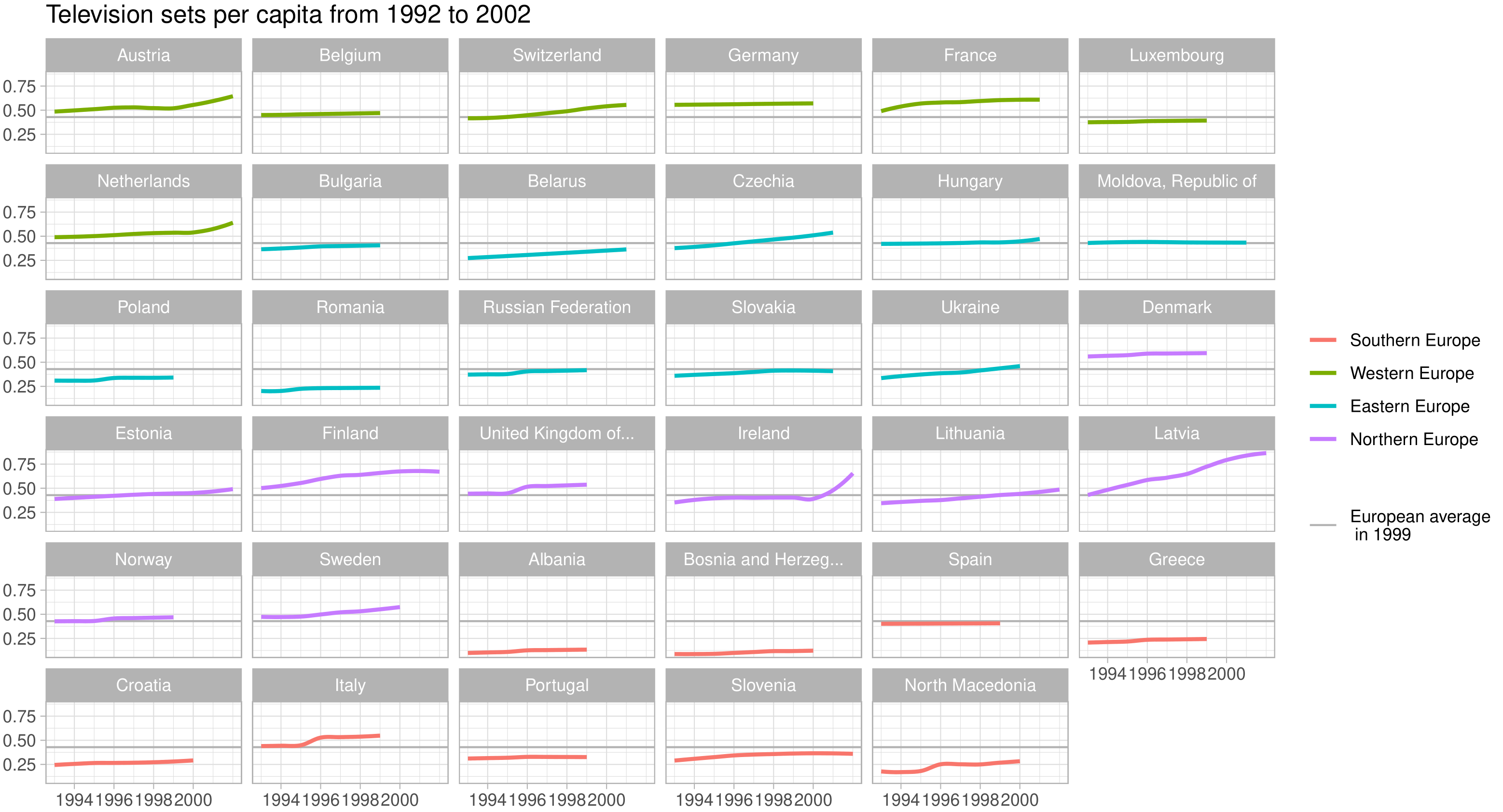
comm_plots_eu %>% filter(!is.na(tv), tv > 100000) %>%
filter(!country_code %in% c("ISL")) %>%
ggplot(aes(x = year, y = tv/population, color = sub_region)) +
geom_hline(aes(yintercept = yintercept, linetype = desc),
data = ref_tv, color = "gray70") +
geom_smooth(se = F, span = 0.7) +
facet_wrap(~country) +
#scale_y_continuous(labels = scales::percent) +
scale_x_continuous(breaks = seq(1992, 2002, 2)) +
theme(legend.title = element_blank()) +
labs(title = paste(labels[4], "per capita from 1992 to 2002"), y = NULL, x = NULL)
#### Newspaper
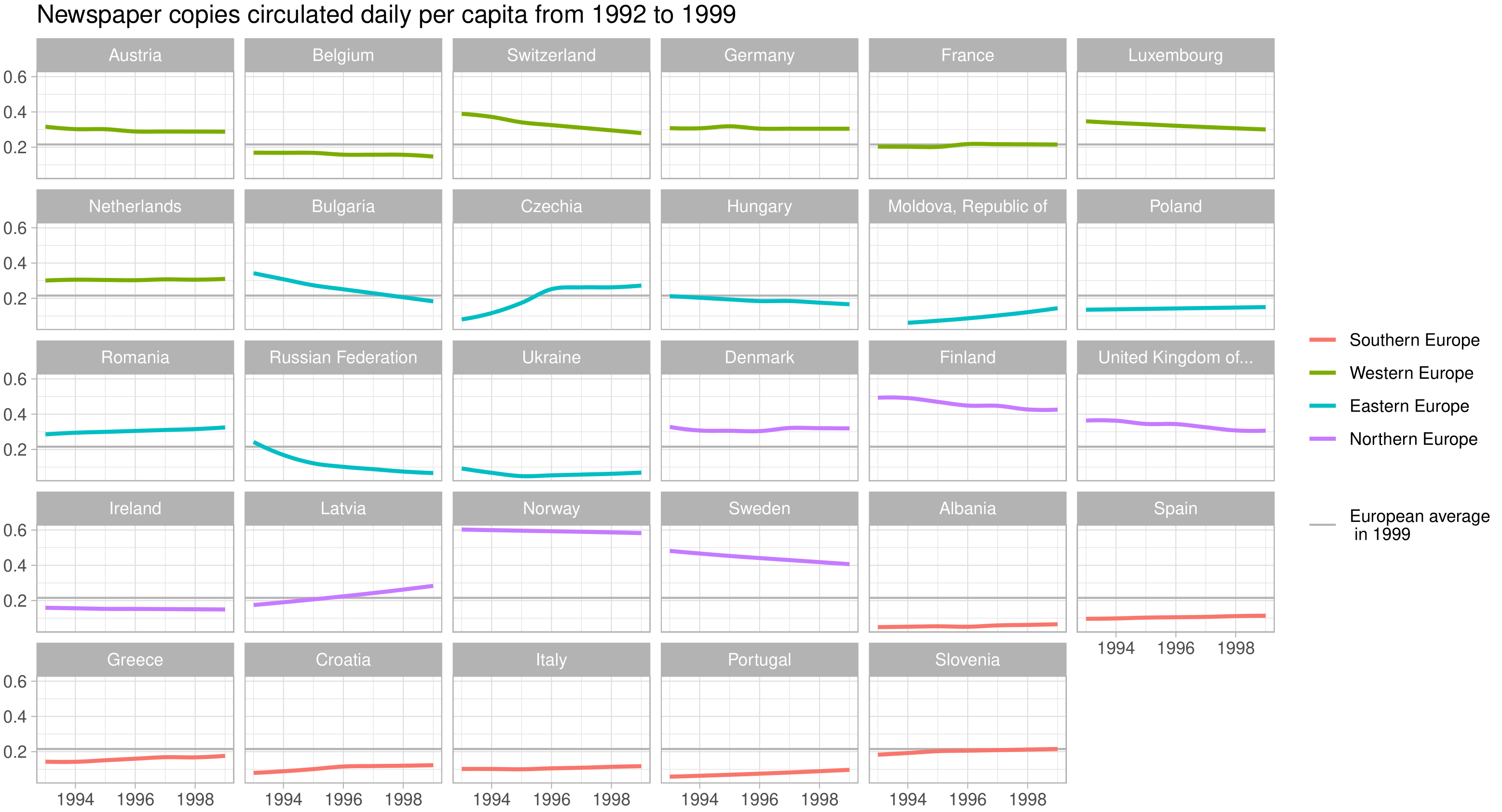
comm_plots_eu %>% filter(!is.na(newspaper), newspaper > 100000) %>%
filter(!country_code %in% c("BLR", "LTU", "SVK", "EST", "BIH")) %>% # those with no plot data
ggplot(aes(x = year, y = newspaper/population, color = sub_region)) +
geom_hline(aes(yintercept = yintercept, linetype = desc),
data = ref_newspaper, color = "gray70") +
geom_smooth(se = F, span = 0.7) +
facet_wrap(~country) +
#scale_y_continuous(labels = scales::percent) +
theme(legend.title = element_blank()) +
labs(title = paste(labels[2], "per capita from 1992 to 1999"), y = NULL, x = NULL)
Click on images to enlarge:


The awards go to…
- Luxembourg for most online country
- Bosnia and Herzegovina for fastest adoption in the past 10 years
- Czechia for most theory-conforming diffusion curve
- Finland for 90s radio nation
- Latvia for 90s TV nation
- Norway for 90s newspaper nation

One thought on “Media Technology Adoption in Europe”