
Opendata.swiss currently provides about 8000 open government data sets from agriculture to health to culture. Here, I’ll be looking at a data set from the Federal Statistical Office containing the 500 most successful Swiss films by theater admissions.
This post is mostly about preparing data for ggplot and customizing figures in R.
You can download the Excel file to a working directory and then import — or, as shown below, get it into R directly from the web. Some clean-up / variable renaming is the first step (using dplyr from the tidyverse).
library(openxlsx)
movies <- read.xlsx("https://www.bfs.admin.ch/bfsstatic/dam/assets/21464060/master", startRow = 3, colNames = TRUE, check.names = TRUE)

names(movies)

library(tidyverse)
movies <- movies %>% transmute(X1 = NULL,
                     title = Originaltitel.des.Films,
                     director = Regisseur.Regisseurin,
                     genre = Genre,
                     year = Produktionsjahr,
                     admissions = Kinoeintritte2.) %>% as_tibble()
Load some more packages required for the analysis:
library(ggrepel)
library(scales)
library(grid)
library(gridExtra)
First look at the data
Check the data structure, variables, and distributions:
movies

year_hist <- movies %>% ggplot(aes(year)) +
  geom_histogram()

admissions_hist <- movies %>% ggplot(aes(admissions)) +
  geom_histogram() + labs(y = NULL)

grid.arrange(year_hist, admissions_hist, ncol = 2)
# A tibble: 510 × 5
title director genre year admis…¹
<chr> <chr> <chr> <dbl> <dbl>
1 SCHWEIZERMACHER, DIE Lyssy Rolf Spie… 1978 942066
2 HERBSTZEITLOSEN, DIE Oberli Bettina Spie… 2006 596272
3 MEIN NAME IST EUGEN Steiner Michael Spie… 2005 580870
4 ACHTUNG, FERTIG, CHARLIE! Eschmann Mike Spie… 2003 560523
5 SCHELLEN-URSLI Koller Xavier Spie… 2014 456159
6 PETITES FUGUES, LES Yersin Yves Spie… 1979 426649
7 GROUNDING Steiner Michael, Fueter Tob… Spie… 2005 377713
8 GÖTTLICHE ORDNUNG, DIE Volpe Petra Spie… 2016 357879
9 SCHWEIZER NAMENS NÖTZLI, EIN Ehmck Gustav Spie… 1988 350681
10 PLATZSPITZBABY Monnard Pierre Spie… 2019 334076
# … with 500 more rows, and abbreviated variable name ¹admissions

Admission by year
As seen above already, admissions are very skewed; pull tail end of the distribution up with log:
ad_plot <- movies %>%
  ggplot(aes(x = year, y = admissions, color = genre)) +
  geom_point()

grid.arrange(ad_plot +
               theme(legend.position = c(0.5,0.75)),
             ad_plot +
               scale_y_log10(labels = label_log()) +
               labs(y = "log(admissions)")+
               theme(legend.position = "none"),
             ncol = 2)

Most successful films by genre
There are fiction movies, documentaries, and animated films in the list; makes sense to separate these.
There are only 3 animated films in the data:
movies %>% count(genre)
# A tibble: 4 × 2
  genre              n
  <chr>          <int>
1 Animationsfilm     3
2 Dokumentarfilm   240
3 Spielfilm        257
4 <NA>              10
movies %>% filter(genre == "Animationsfilm") %>%
  ggplot(aes(x = year, y = admissions)) +
  geom_point() +
  geom_text_repel(aes(label = title))

Now, let’s focus on movies and documentaries. Only the top films get labels so it’s not too crowded. For geom_text_repel(), the easiest way is probably to prepare the data such that the title label is empty for those we don’t want labeled in the plot (see the case_when() function below). Some titles are also very long, so we might want to truncate those first using str_trunc(). Finally, the two plots are combined using grid.arrange(), where we can also add some additional text such as the data source.
## Spielfilm (movie) cut-off 300k
spiel <- movies %>% mutate(title0 = title, title = "") %>%
  mutate(title = case_when(admissions > 300000 & genre == "Spielfilm" ~ title0,
                           TRUE ~ title)) %>%
  mutate(title = str_trunc(title, 25)) %>%
  filter(genre == "Spielfilm") %>%
  ggplot(aes(x = year, y = admissions)) +
  geom_point(color = "midnightblue", alpha = 0.6) +
  expand_limits(x = c(1975, 2021)) +
  scale_x_continuous(breaks = seq(1975, 2020, by = 5)) +
  geom_text_repel(aes(label = title),
                   size = 3,
                   min.segment.length = 0,
                   box.padding = 0.3,
                   color = "midnightblue")

## Dokumentarfilm (documentary) cut-off 50k
dok <- movies %>% mutate(title0 = title, title = "") %>%
  mutate(title = case_when(admissions > 50000 & genre == "Dokumentarfilm" ~ title0,
                           TRUE ~ title)) %>%
  mutate(title = str_trunc(title, 25)) %>%
  filter(genre == "Dokumentarfilm") %>%
    ggplot(aes(x = year, y = admissions)) +
    geom_point(color = "midnightblue", alpha = 0.6) +
    expand_limits(x = c(1975, 2021)) +
    scale_x_continuous(breaks = seq(1975, 2020, by = 5)) +
    geom_text_repel(aes(label = title),
                     size = 3,
                     min.segment.length = 0,
                     box.padding = 0.4,
                     color = "midnightblue")

grid.arrange(spiel +
               labs(x= NULL, y = NULL, title = "Fiction") +
               theme(axis.text.x=element_blank()),
             dok + labs(x = NULL, y = NULL, title = "Documentaries"),
             top = textGrob("Most successful Swiss films",
                            gp = gpar(fontsize = 16,font = 2)),
             bottom = "Production year",
             left = "Movie theatre admissions",
             right = textGrob("Data: opendata.swiss",
                              gp = gpar(fontsize = 8), rot = 90))
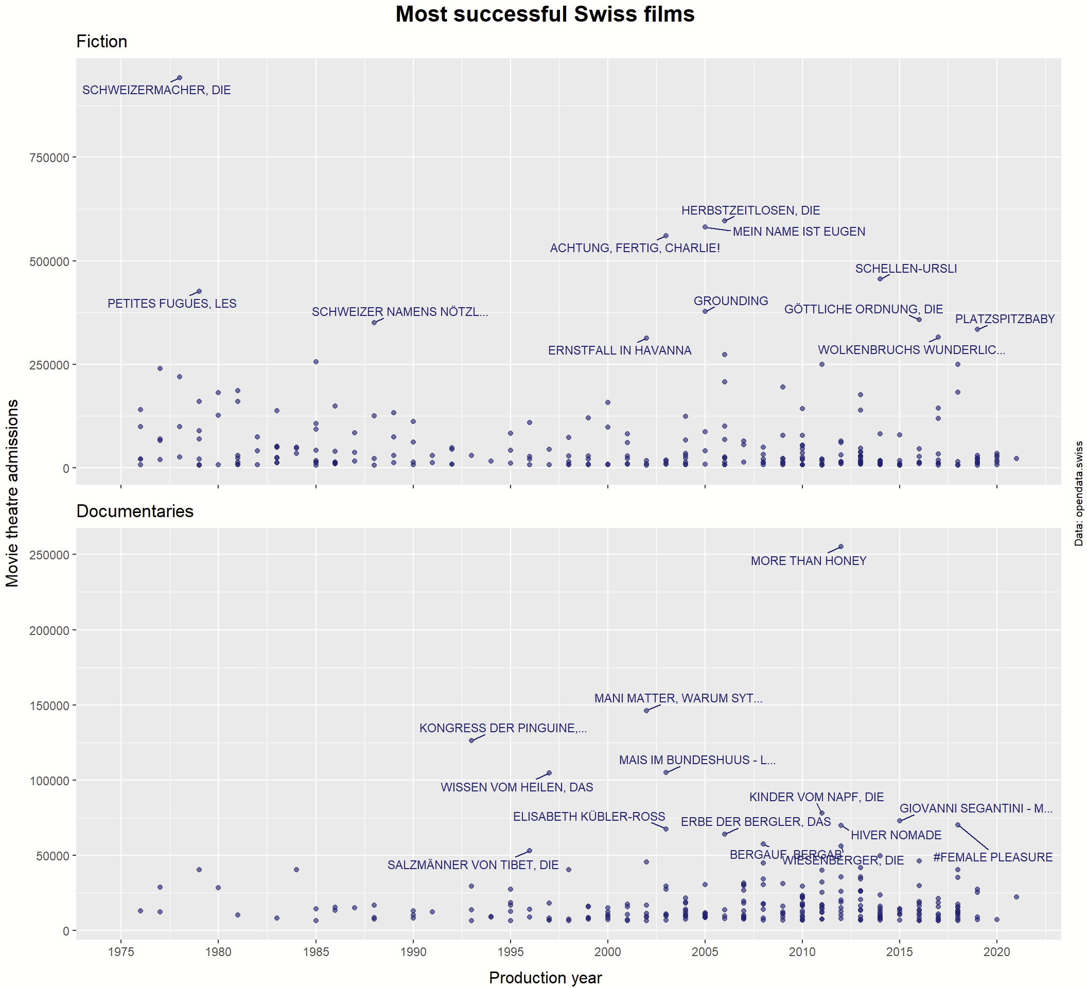
Now we have quite an informative but not overcrowded figure. Separating the two categories (movies and documentaries) makes sense here because they are at very different levels of the Y-axis (admissions). I chose not to take the log of admissions because the top films are spread out enough and this way it’s more intuitively interpretable.
And here are the winners, all of which can be streamed for free on https://www.playsuisse.ch:
