

In the type of social science survey data I work with, there is often a continuous variable of interest and a couple of categorical grouping variables. The continuous outcome may be something like “percent who agree” or a composite score, e.g., a rating of something using multiple items.
Let’s generate some data df consisting of an outcome variable for 2000 people that is at least somewhat dependent on their sex and age:
library(tidyverse)
n <- 2000
set.seed(42)

df <- tibble(
  sex = factor(sample(c("male", "female"), n, replace = TRUE)),
  age = factor(sample(c("20-29", "30-39", "40-49", "50-59", "60+"), n, replace = TRUE, prob = c(0.5,1.3,2,1.3,2))),
  outcome = rnorm(n, mean = 50, sd = 12) +
    ifelse(sex == "female", rnorm(n, mean = 3, sd = 5), rnorm(n, mean = -4, sd = 3)) +
    ifelse(age == "30-39", rnorm(n, mean = 2, sd = 2), 0) +
    ifelse(age == "40-49", rnorm(n, mean = 4, sd = 3), 0) +
    ifelse(age == "60+", rnorm(n, mean = -5, sd = 5), 0),
  none = "ungrouped"
)
Calculate the mean using dplyr
Before calculating means, I’d take a look at the distribution overall, but especially in the groups of interest:
df |> ggplot(aes(outcome)) +
  geom_density(aes(color = sex,
                   fill = sex),
               alpha = 0.3) +
  facet_wrap(~age, nrow = 2) +
  theme(legend.position = "inside",
        legend.position.inside = c(.85, .25))

In any case, after having visually inspected the data in this way (if the data were extremely bimodal or skewed, maybe the mean wouldn’t make much sense), the standard summary statistic is the mean value. This can be calculated using dplyr style R code, first for the “grand mean”, i.e., overall:
df |> summarise(mean_outcome = mean(outcome))
In survey data, there will often be missing values and a weight variable to adjust the proportion of respondents to an external, known distribution (for instance, people from one region may have been oversampled, either by design or by chance, and for the calculation of a global average, they need to weighted down accordingly). This case can be handled as follows:
df |> summarise(mean_outcome =
  weighted.mean(outcome, w = weight, na.rm = TRUE))
Add grouping variables
Now let’s say the interest lies in differences between men and women as well as between age groups, you can add the group_by() function:
 df |> group_by(sex, age) |>
  summarise(mean_outcome = mean(outcome))
This will output a tibble with the mean values of the outcome variable for all combinations of the sex and age variables (these should be of type factor):
# A tibble: 10 × 3
# Groups:   sex [2]
   sex    age   mean_outcome
   <fct>  <fct>        <dbl>
 1 female 20-29         56.2
 2 female 30-39         55.0
 3 female 40-49         57.5
 4 female 50-59         54.1
 5 female 60+           47.9
 6 male   20-29         47.1
 7 male   30-39         48.3
 8 male   40-49         49.6
 9 male   50-59         45.7
10 male   60+           41.4
This tibble can be directly piped to ggplot(), assigned a name and thus stored as an object, exported to CSV, or further manipulated for your purposes. However, it would be nice to also get a measure of uncertainty around the mean, since we are dealing with a sample here but ultimately care about inferences to the population.
A custom function for the mean and confidence interval
Motivation
Because this case of needing to calculate the mean of an outcome variable for one or two grouping variables came up so often, I decided to construct a custom function. Instead of starting with t-tests or ANOVAs, I like to visually inspect the data (see above), but to get a sense of the variation of the values, a useful statistic to also visualize is the confidence interval of the mean. In general then, whenever the confidence intervals of the means for two groups do not overlap, it may be said that the means are significantly different (this is not mathematically identical to a t-test, but in the vast majority of cases will lead to the same substantive conclusion).
Implementation
I’ve tried different ways of passing the variables to the function and then using curly-curly {{ }} or bang bang !! to unquote for tidy evaluation. I’m not sure what the best solution is and I don’t fully understand it, but the current implementation works as long as the variable names are in quotes as arguments for the function.
As a first step, we need a new standard deviation function, analogous to the built-in weighted.mean() function, since the standard deviation is needed to calculate the confidence interval. I copied this code from the jtools package:
wtd.sd <-
  function (x, weights){
    xm <- weighted.mean(x, weights, na.rm = TRUE)
    variance <- sum((weights * (x - xm)^2)/(sum(weights[!is.na(x)]) -
                                              1), na.rm = TRUE)
    sd <- sqrt(variance)
    return(sd)
  }
The upper and lower bounds of the confidence interval are equal to the mean plus and minus the margin of error, which we get by multiplying the standard error (for which we need the standard deviation) with the 97.5%-quantile (for the 95% confidence interval) of the standard normal distribution (i.e., 1.96). In R code, it looks like this:
    df |>
      summarize(
        M = weighted.mean(nv, na.rm = TRUE, w = w),
        SD = wtd.sd(nv, weights = w),
        N = sum(w), # without weights, it's just n()
        SE = SD / sqrt(N), # standard error
        margin = qt(.975, df = N - 1) * SE, # 95% CI / alpha = 5%
        upper = M + margin,
        lower = M - margin
      )
Wrapped into a single function called mci_summary() (“mean and confidence interval summary”) that takes a numeric outcome variable, two grouping variables, and optionally a weight variable as inputs:
mci_summary <-
  # INPUTS
  function(.data,
           groupvar1,
           groupvar2,
           numvar,
           # no defaults up to here, have to be provided
           weight = NULL) {
    # by default weight is 1 (equiv. to no weight), but can be provided
    # STEPS
    require(tidyverse)

    # unquote and get the variables into a working tibble
    g1 <- sym(groupvar1)
    g2 <- sym(groupvar2)
    nv <- sym(numvar)
    df <- .data |>
      select(!!g1, !!g2, !!nv) |>
      rename(g1 = 1, g2 = 2, nv = 3) # with this renaming based on position, I don't need !! later

    # create an external weights vector depending on whether a weights variable name was provided or not
    # if provided, use that; if not, it needs to be 1 in every row, effectively meaning no weighting
    if (is.character(weight)) {
      w_ext <- .data |>
        select(!!sym(weight)) |>
        pull(weight)
    } else {
      w_ext <- rep(1, nrow(.data))
    }
    # add the weight variable to the working tibble, which was either provided or created now (all 1s)
    df <- df |> mutate(w = w_ext)

    df |> #
      group_by(g1, g2) |> # bang bang on symbol type used to unquote var names for tidy selection
      summarize(
        M = weighted.mean(nv, na.rm = TRUE, w = w),
        SD = wtd.sd(nv, weights = w), # the wtd.sd() function needs to be defined before
        N = sum(w),
        # without weights just n()
        SE = SD / sqrt(N),
        # standard error
        margin = qt(.975, df = N - 1) * SE,
        # 95% CI / alpha = 5%
        upper = M + margin,
        lower = M - margin
      ) |>
      ungroup() |>
      mutate(numvar = numvar) |> # indicate the numeric variable used
      rename_with(~ c(groupvar1, groupvar2), .cols = c(g1, g2)) |> # go back to original var names
      select(numvar, everything()) # move to first column
  }
Using the function
Now the custom mci_summary() function can be applied (in this example, we won’t deal with weights, but that would work as well):
 df |> mci_summary(
  groupvar1 = "sex",
  groupvar2 = "age",
  numvar = "outcome")
The resulting tibble contains the mean and the confidence interval of the mean (the upper and lower columns) for each group of interest, i.e., each combination of sex and age group:
# A tibble: 10 × 10
   numvar  sex    age       M    SD     N    SE margin upper lower
   <chr>   <fct>  <fct> <dbl> <dbl> <dbl> <dbl>  <dbl> <dbl> <dbl>
 1 outcome female 20-29  52.0  12.0    70 1.43    2.86  54.9  49.2
 2 outcome female 30-39  54.3  12.6   199 0.893   1.76  56.1  52.5
 3 outcome female 40-49  56.7  13.5   280 0.806   1.59  58.3  55.1
 4 outcome female 50-59  51.8  12.8   165 0.996   1.97  53.8  49.9
 5 outcome female 60+    48.7  13.9   269 0.845   1.66  50.4  47.1
 6 outcome male   20-29  48.2  14.0    88 1.49    2.97  51.2  45.3
 7 outcome male   30-39  47.9  13.0   184 0.959   1.89  49.8  46.0
 8 outcome male   40-49  49.8  12.6   274 0.760   1.50  51.3  48.3
 9 outcome male   50-59  45.3  12.2   195 0.874   1.72  47.0  43.6
10 outcome male   60+    40.7  13.6   276 0.818   1.61  42.3  39.1
Plotting the summary statistics
We can directly use the upper and lower limits of the confidence interval in geom_errorbar() and with some additional geoms, it looks like this:
pd = position_dodge(0.2) # defined here for easy reuse

# the actual plot, piping the summary directly to ggplot()
df |> mci_summary(
  groupvar1 = "sex",
  groupvar2 = "age",
  numvar = "outcome") |>
  ggplot(aes(x = age, y = M, group = sex, color = sex)) +
  geom_line(position = pd) +
  geom_errorbar(aes(ymin = lower, ymax = upper), width = 0.2,
                position = pd) +
  geom_point(size = 4, position = pd) +
  geom_text(aes(label = round(M,1)),
            position = pd,
            vjust = -0.4, hjust = -0.5,
            show.legend = FALSE) +
  scale_y_continuous(limits = c(0,70)) +
  scale_color_discrete(name = NULL) +
  labs(y = "outcome")
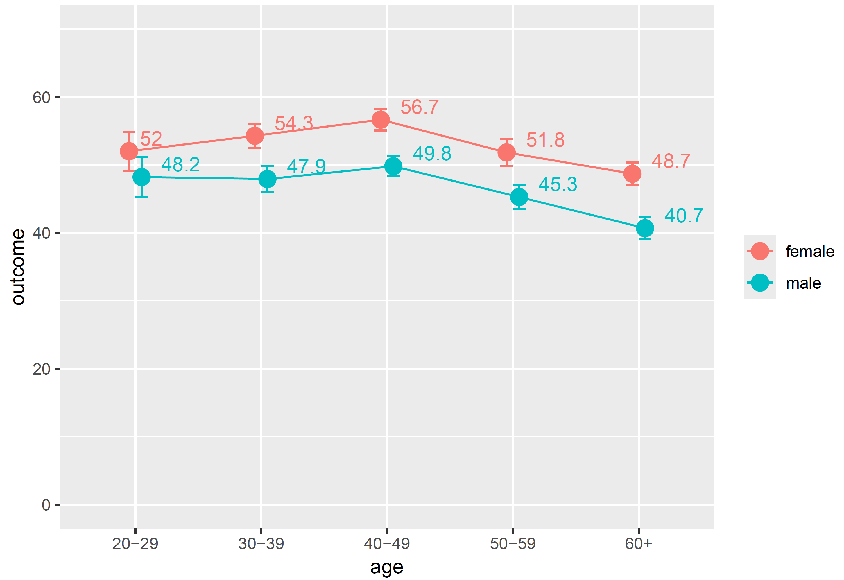
In this synthetic data, we can observe that the outcome is significantly higher for women except in the youngest age group. For 20 to 29 year-olds, the means of 52.0 for the 70 sampled women and 48.2 for the 88 men, given the variance in their values, are not sufficiently precise to conclude that there is a difference in the population. I find this visual analysis very intuitive. In this case, age as a grouping variable is ordinal, so I think the geom_line() that connects the means makes sense. It could give hints regarding the linearity of the association and indicate if it might make sense to use the age variable ungrouped, i.e., as a numeric variable. If this were a nominal/categorical grouping variable with no meaningful order, such as region, I’d probably leave the line out. The position_dodge() is useful whenever the values might overlap on the y-axis: in this case, it shifts the points and error bars a bit right for men and a bit left for women such that you can still tell them apart.
I was unable to elegantly define the function such that you can easily change the number of variables. But say you only wanted to look at the age differences, regardless of sex, a quick work-around is to define a character constant in the data (see the none = "ungrouped" in the tibble() function above) and use this as the second group variable argument:
df |> mci_summary(
  groupvar1 = "age",
  groupvar2 = "none",
  numvar = "outcome") |>
  ggplot(aes(x = age, y = M, group = 1)) +
  geom_line() +
  geom_errorbar(aes(ymin = lower, ymax = upper), width = 0.2) +
  geom_point(size = 4) +
  geom_label(aes(label = round(M,1)),
            vjust = -0.4, hjust = -0.5,
            show.legend = FALSE) +
  scale_y_continuous(limits = c(0,70)) +
  labs(y = "outcome")

This plot can for instance tell you that the upper bound for the 60+ age group is lower than the lower bound of any of the other age groups, so the mean of 44.7 is in fact significantly lower than all the others.
