
After not using a reference manager at first (2014–2016) and later being very frustrated with Mendeley after a couple of years, I started using Zotero in 2018. I am extremely happy with the software and its features – it just works very well for everything I do. The browser plugin to import the full citation info and the PDF (if you do not have institutional access through your IP, it will often even automatically find an open access version) with one click is great. Word integration is also seamless and keyboard short cuts can be customized; switching styles is extremely easy. Libraries can also be hosted on their server and synced or shared with others, if you need a lot of storage for full texts, you’ll need premium. If you sync your library, you can access it from any browser also. You can import from and export to various formats. Zotero’s built-in PDF reader now also supports text highlighting in multiple colors and commenting and you can save notes along with each entry. And, it’s open source and free.
Currently, I have about 4000 entries in my main library and I was curious what kind of articles I’d been collecting, reading, and citing in the past couple of years.
You can export the entire library to CSV through the menu. So let’s jump into R and have look. I used this mainly as an exercise for myself to get used to the whole dplyr and pipe (%>%) logic.
Import CSV file and setup
zotero <- read.csv("C:/testing/zoteroLibrary/zotero.csv") # import
names(zotero)[1] <- "Key" # rename the first variable

library(tidyverse) # load tidyverse for dplyr and ggplot2

zotero <- as_tibble(zotero) # convert df to tibble
zotero$Publication.Title <- as.factor(zotero$Publication.Title) # title as factor, not character
First look at the journals
This counts the number of entries per publication title (i.e., journal, or for R, the factor level) after having excluded those rows that are empty on the publication title variable.
zotero %>%
  filter(Publication.Title != "") %>%
  count(Publication.Title) %>%
  arrange(desc(n))
## # A tibble: 1,057 x 2
##    Publication.Title                                   n
##    <fct>                                           <int>
##  1 New Media & Society                               142
##  2 Information, Communication & Society              111
##  3 Computers in Human Behavior                        76
##  4 Current Opinion in Psychology                      50
##  5 Social Science Computer Review                     49
##  6 International Journal of Communication             47
##  7 Journal of Communication                           44
##  8 Proceedings of the National Academy of Sciences    44
##  9 Big Data & Society                                 43
## 10 Social Media + Society                             41
## # ... with 1,047 more rows
Constructing a new data frame with selected variables
I am only interested in the main publication types and have a bunch of untitled stuff or PDFs without meta data in my library, so I need to exlude those first. Journal articles, book sections, and other types have an entry in Publication.Title but books don’t, so to not lose books, I used and OR condition for the filter. There is a also a field for when an entry was added to Zotero and R needs to know the date format to deal correctly with that.
bib <- zotero %>%
  select(Publication.Year, Publication.Title, Item.Type, Author, Title, Date.Added, Url, DOI)

bib <- bib %>%
  filter(Publication.Title != "" | Item.Type == "book")

bib <- bib %>%
  filter(Publication.Year != "")

bib$Date.Added <- as.Date(bib$Date.Added, format = "%d/%m/%Y %H:%M")


bib$monthyear <- format(bib$Date.Added, "%Y %m") # this is no longer date format, but can be handy
bib$monthyear <- as.factor(bib$monthyear)
When was stuff added?
Now I can plot the number of new entries by month (the date variable has the information down to the second but monthly was a reasonable granuarity here).
added <- bib %>%
  count(monthyear) # prepping a df with the frequencies, could also be done in the plot function only

ggplot(added, aes(x = monthyear, y = n, group = 1)) +
  geom_point(stat = "identity") +
  geom_line() +
  theme(axis.text.x=element_text(angle=45, hjust=1)) +
  labs(x="", y="")
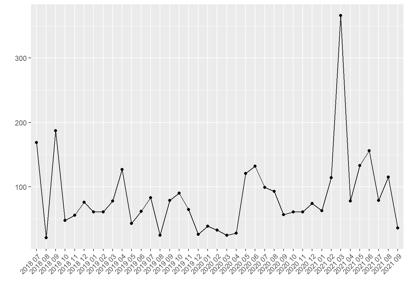
mean(added$n) # monthly average
## [1] 85.12821
mean(added$n)/(365/12) # daily average
## [1] 2.798736
I checked to see what happened in March 2021 and it was when I merged in another library where we had collected about 250 papers for a literature review for a project proposal.
Using the whole data frame (bib), this can also be split up e.g. by Item.Type.
ggplot(bib, aes(x = monthyear, group = Item.Type, color = Item.Type)) +
  geom_point(stat = "count") +
  geom_line(stat = "count") +
  theme(axis.text.x=element_text(angle=45, hjust=1)) +
  labs(x="", y="")

Clearly, journal articles dominate the library with 84% of all entries:
type <- bib %>%
  count(Item.Type) %>%
  arrange(desc(n))

ggplot(type, aes(x = reorder(Item.Type, -n), y = n)) +
  geom_bar(stat="identity") +
  theme(axis.text.x=element_text(angle=45, hjust=1)) +
  labs(x="", y="") +
  scale_y_continuous(breaks = seq(200, 2800, 200))

bib %>%
  count(Item.Type) %>%
  arrange(desc(n)) %>%
  mutate(prop = prop.table(n))
## # A tibble: 9 x 3
##   Item.Type               n    prop
##   <chr>               <int>   <dbl>
## 1 journalArticle       2778 0.837
## 2 book                  197 0.0593
## 3 bookSection           189 0.0569
## 4 conferencePaper        48 0.0145
## 5 webpage                37 0.0111
## 6 blogPost               31 0.00934
## 7 newspaperArticle       26 0.00783
## 8 magazineArticle         8 0.00241
## 9 encyclopediaArticle     6 0.00181
Top 40 journals
Next, I looked into the journals whose articles I save most and thus probably read and cite most.
topj <- bib %>%
  filter(Item.Type == "journalArticle") %>%
  count(Publication.Title) %>%
  arrange(desc(n)) %>%
  slice(1:40)

ggplot(topj, aes(x = n, y = reorder(Publication.Title, n))) +
  geom_bar(stat="identity") +
  labs(x="", y="") +
  scale_x_continuous(breaks=seq(10, 150, 10))

New Media & Society comes out on top with quite a margin which didn’t surprise me. The high frequency of Current Opinion in Psychology papers is due to the fact that I am writing a piece for a special issue in that journal and downloaded a bunch of papers because I actually had never heard of it before that. Information, Communication & Society, Social Science Computer Review, Social Media + Society, and International Journal of Communication are all journals I have published in and regularly read articles from.
When were things published?
Finally, I looked into when the articles, books, chapters, etc. I have in my library were published. The earliest paper is from 1890, but the distribution is of course very heavily skewed towards the past couple of years (more than I expected actually). So for the plot, the range is cut at 1990.
range(bib$Publication.Year)
## [1] 1890 2021
bib90 <- bib %>%
  filter(Publication.Year >= 1990)

ggplot(bib90, aes(x = as.factor(Publication.Year))) +
  geom_histogram(stat="count") +
  theme(axis.text.x=element_text(angle=45, hjust=1)) +
  labs(x="", y="")

There is no real take-away here – I enjoyed learning some tidyverse code and confirmed my intuitions about which journals feature frequently in my research.
